

SPIDER SALOFF CONCERT
2019 | Poster, Mailer, Promotional Materials
CLIENT
Autism McLean
CONCEPT
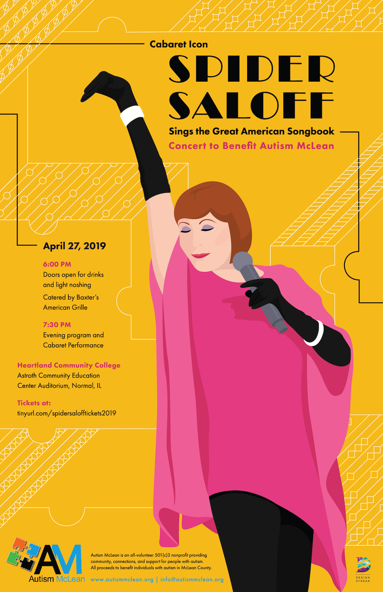
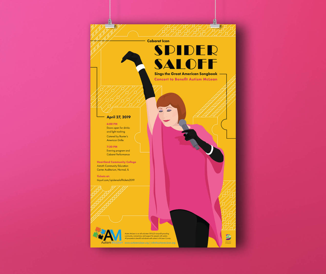
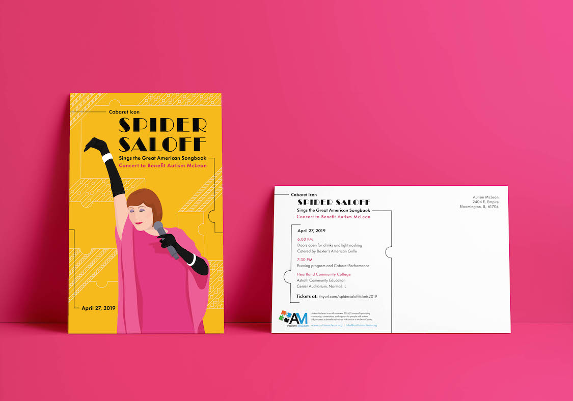
Spider Saloff’s benefit concert for Autism McLean brings the community together to raise support for Autism McLean in creating an Autism Friendly Community. As a group we were inspired by Spider Saloff’s personality, style, and dazzling performances. When we began our research we were drawn travel posters and Vogue covers from the 1920s, as well as artists such as Eduardo Garcia Benito and Rene Gruau, who created glamorous shaped based illustrations. Our research motivated our illustration style and typography choice. Each photo of Spider showcased a different aspect of her performance, but we chose to illustrate this one because it perfectly captured her fun and fabulous side. We aimed to portray this through the illustration with the shaped based style and bright warm colors. The large decorative typography and line work is inspired by the boldness and drama present in the art deco movement. A gold background was chosen to tie in the bright and energetic personality of the illustration. The patterning and white lines in the background is created from abstracted puzzle pieces and six sections of line. The six patterned sections are representative of the spectrum of Autism. This is similar to how it is converted as six colors in the Autism Friendly Community. These patterns and lines express people coming together to create an Autism Friendly Community. By use of the black lines, we are guiding the viewer to the different information about the event throughout the poster and marketing materials.
DESIGN STREAK STUDIO
Brianna Blair, Beth Kavanaugh, Lila Mereness


