THE ALLIANCE FOR JUST MONEY LOGO
2018 | Logo
CLIENT
The Alliance For Just Money
CONCEPT
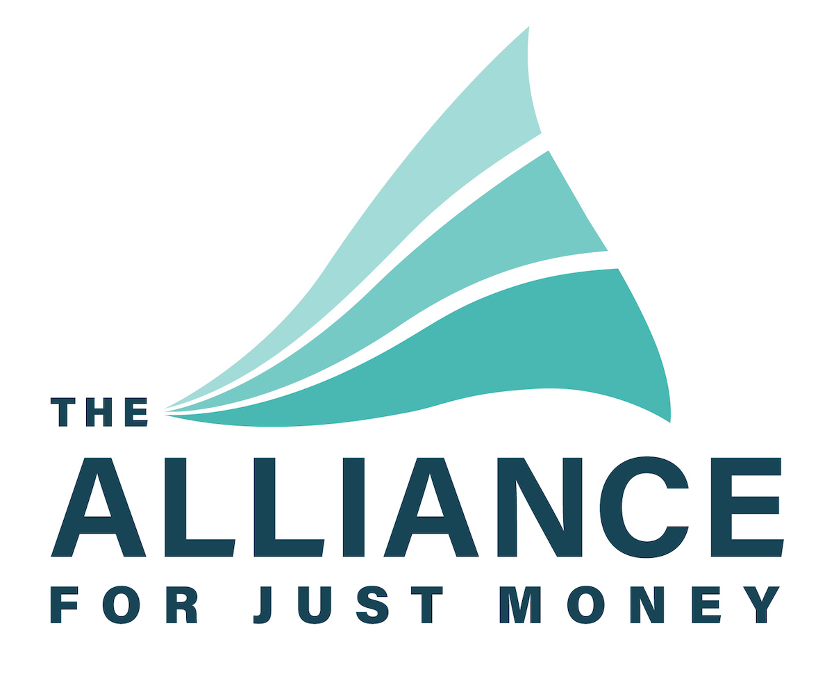
The Alliance For Just Money’s mission is to research, educate, and organize for monetary reform on behalf of public sovereign money. These three reforms must be implemented together to achieve real monetary reform. The concept for our logo is “creating a wave of change” to our current monetary system with these three reforms. The three organic forms represents the transformation and positive uprise movement that The Alliance will create. Paired with the wave, the font Acumin has a very simple structure and an expansive range of width and weight variations for creating a dynamic and minimal logo. This typeface can be used towards all promotional materials for branding the organization. We chose a light blue/green for the wave because it represents the trust and freedom to share individual ideas within the organization. We selected dark blue for the text because it symbolizes the organization’s loyalty towards its members, and the responsibility and commitment the organization has towards achieving their goal of monetary reform in both grassroots and global context.
DESIGN STREAK STUDIO
Brianna Blair, Evan Morris, Jessica Tung
THE ALLIANCE FOR JUST MONEY LOGO
2018 | Logo
CLIENT
The Alliance For Just Money
CONCEPT
The Alliance For Just Money’s mission is to research, educate, and organize for monetary reform on behalf of public sovereign money. These three reforms must be implemented together to achieve real monetary reform. The concept for our logo is “creating a wave of change” to our current monetary system with these three reforms. The three organic forms represents the transformation and positive uprise movement that The Alliance will create. Paired with the wave, the font Acumin has a very simple structure and an expansive range of width and weight variations for creating a dynamic and minimal logo. This typeface can be used towards all promotional materials for branding the organization. We chose a light blue/green for the wave because it represents the trust and freedom to share individual ideas within the organization. We selected dark blue for the text because it symbolizes the organization’s loyalty towards its members, and the responsibility and commitment the organization has towards achieving their goal of monetary reform in both grassroots and global context.
DESIGN STREAK STUDIO
Brianna Blair, Evan Morris, Jessica Tung