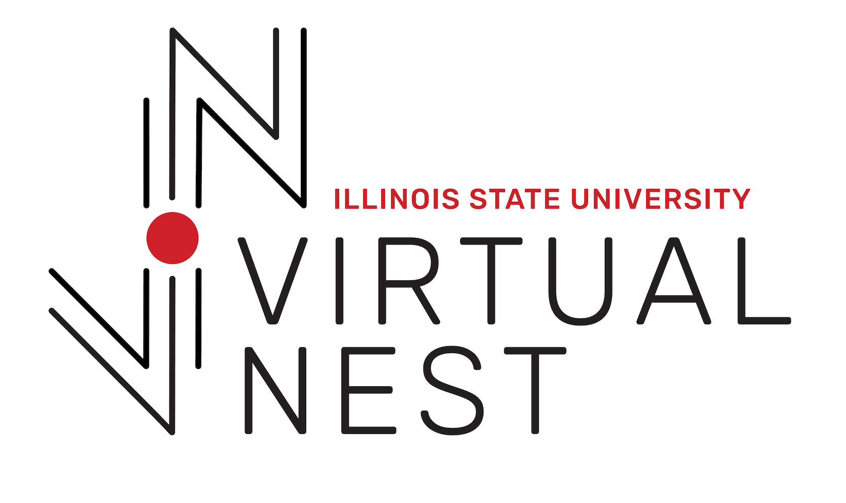
VIRTUAL NEST LOGO
2018 | Logo
CLIENT
Illinois State University's Virtual Nest
CONCEPT
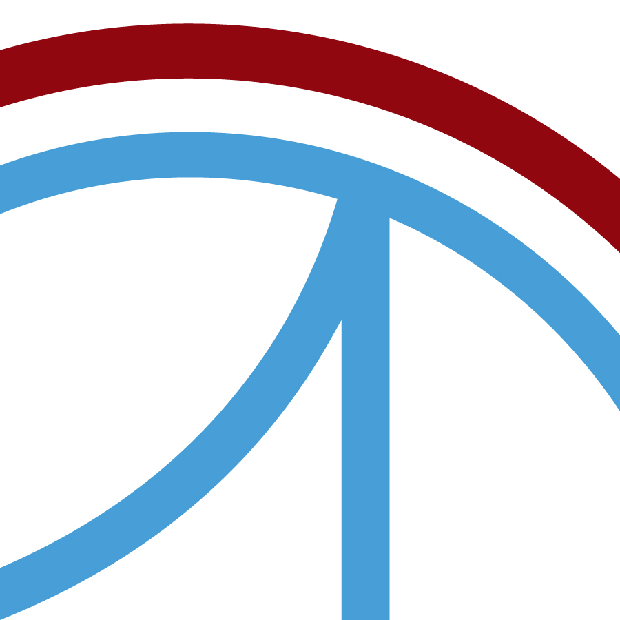
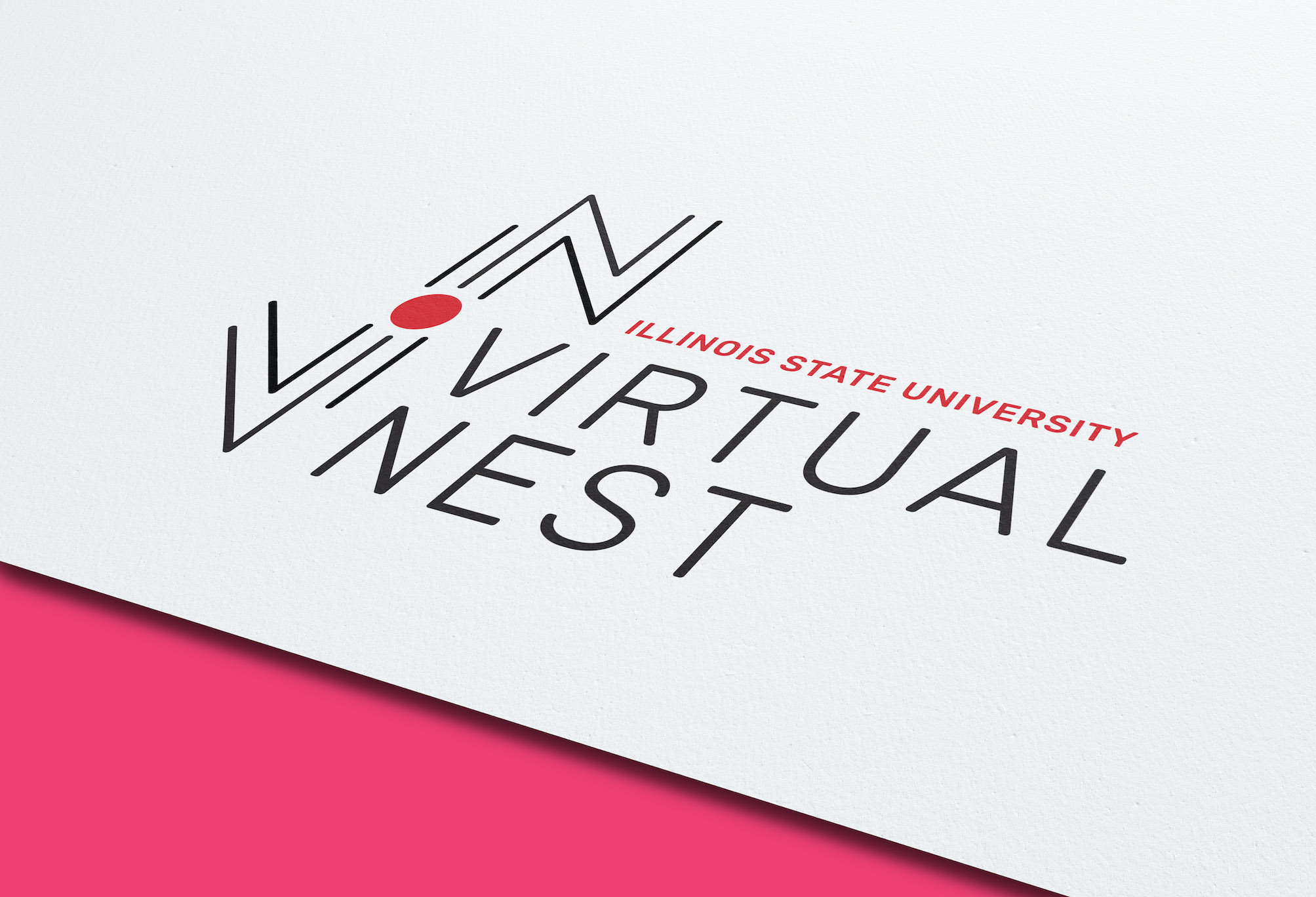
Virtual Nest will bring an incredibly unique experience to Illinois State; one in which we see the joining of digital and analog learning. To reflect that, we designed a logo which displayed both of those qualities. The logo itself is comprised of two parts: the illustration on the left, and type on the right. Within the illustrative mark can be observed a “V” and “N”, formed by angled lines, centering a red circle. This circle represents the individual, as well as the entire Nest: an organic form, to reflect the human aspect. Around the red circle are lines which form angled sides, in stark contrast to the circular nest. These lines represent the technological aspect of Virtual Nest; the great resource which people are interfacing with. These two elements combine to create an image which presents the entire experience of Virtual Nest, in a clean and abstract manner. With this diachotomy in the image, we chose a geometric font that was stable, angular and rounded. Finally, we used Illinois State red for the university’s name and also the Nest itself to create a visual connection between the two entities.
DESIGN STREAK STUDIO
Brianna Blair, Derek Droessler, John Striepling
VIRTUAL NEST LOGO
2018 | Logo
CLIENT
Illinois State University's Virtual Nest
CONCEPT
Virtual Nest will bring an incredibly unique experience to Illinois State; one in which we see the joining of digital and analog learning. To reflect that, we designed a logo which displayed both of those qualities. The logo itself is comprised of two parts: the illustration on the left, and type on the right. Within the illustrative mark can be observed a “V” and “N”, formed by angled lines, centering a red circle. This circle represents the individual, as well as the entire Nest: an organic form, to reflect the human aspect. Around the red circle are lines which form angled sides, in stark contrast to the circular nest. These lines represent the technological aspect of Virtual Nest; the great resource which people are interfacing with. These two elements combine to create an image which presents the entire experience of Virtual Nest, in a clean and abstract manner. With this diachotomy in the image, we chose a geometric font that was stable, angular and rounded. Finally, we used Illinois State red for the university’s name and also the Nest itself to create a visual connection between the two entities.
DESIGN STREAK STUDIO
Brianna Blair, Derek Droessler, John Striepling