TOWNSHIP OF NORMAL LOGO
2019 | Logo
CLIENT
Township of Normal
CONCEPT
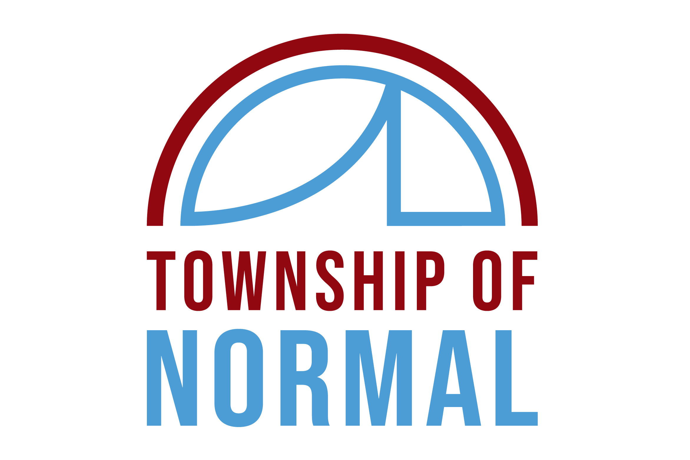
The Township of Normal aims to provide services for all local residences in ways of general assistance, property assessments, and road and bridge maintenance. Normal Township also offers programs for the senior citizens within the community through the ARC facility. The ARC houses recreational activities, a wide range of services, health support, and a place to socialize. When designing our logo, we were inspired by the already established branding of the ARC. Our group wanted the Township logo to have some reference to the recreational facility. This reference is evident in the maroon arch, which resembles an umbrella that encompasses the community. This provides a sense of protection and care for the Township's citizens. The blue form underneath the maroon arch represents the Township of Normal. On the left, the slope rising upward represents the path of life that one takes. The right angle supporting the rising slope symbolizes the strength and support the Township of Normal provides for its citizens on their path through life. The colors chosen were blue and maroon, with blue creating a feeling of trust, consciousness, and stability, and maroon emanating a sense of leadership and determination. The fonts used are sans serif which represents simplicity and modernity. The text stacks neatly flush at the ends showcasing balance and stability.
DESIGN STREAK STUDIO
Brianna Blair, Alyse Lanier, Kyle Mitchel
TOWNSHIP OF NORMAL LOGO
2019 | Logo
CLIENT
Township of Normal
CONCEPT
The Township of Normal aims to provide services for all local residences in ways of general assistance, property assessments, and road and bridge maintenance. Normal Township also offers programs for the senior citizens within the community through the ARC facility. The ARC houses recreational activities, a wide range of services, health support, and a place to socialize. When designing our logo, we were inspired by the already established branding of the ARC. Our group wanted the Township logo to have some reference to the recreational facility. This reference is evident in the maroon arch, which resembles an umbrella that encompasses the community. This provides a sense of protection and care for the Township's citizens. The blue form underneath the maroon arch represents the Township of Normal. On the left, the slope rising upward represents the path of life that one takes. The right angle supporting the rising slope symbolizes the strength and support the Township of Normal provides for its citizens on their path through life. The colors chosen were blue and maroon, with blue creating a feeling of trust, consciousness, and stability, and maroon emanating a sense of leadership and determination. The fonts used are sans serif which represents simplicity and modernity. The text stacks neatly flush at the ends showcasing balance and stability.
DESIGN STREAK STUDIO
Brianna Blair, Alyse Lanier, Kyle Mitchel